

FileFillet, the Mac app that makes organizing files a breeze.

ROLE:
UX/UI Designer, Researcher
DURATION:
5 weeks
KEY SKILLS:
Ideation, Interviews, Journey Mapping, Competitive Analysis, Visual Design.
TOOLS:
Figma
ABOUT FILEFILLET
FileFillet is a data transfer service that allows users to quickly move large quantities of files without opening extra windows, keeping their workspace clear of clutter. The goal of this externship was to learn what can be done to improve the app through validating assumptions about what already works, what needs improvement, and understanding who will be using this platform. With this task at hand, me and a team consisting of two other UX/UI Designers embarked to improve FileFillet.
THE PROBLEM
Transferring files to external storage devices on macOS has never been as easy as it should. Between requiring extra steps with the Finder interface and issues with device detecting, FileFillet seeks to simplify and streamline the process.
SECONDARY RESEARCH
MARKET RESEAERCH
My fellow UX/UI Designers and I started with Market Research in an organized effort to gather information about target markets and customers, know about them, starting with who they are.
THE QUESTIONS WE FOCUSED ON WERE:
How can animation be implemented at the forefront to help meet business goals?
What can be offered to reward users by completing a data transfer?
How effective can data transfer apps be with hardware, software, and data support?
Who are the users that need more efficient data transfer methods?
TAKEAWAYS:
ANIMATIONS
Consistency and visual hierarchy are vital
Needs to contribute to offering a reward to the user
Give the app a living feeling and respond to users' needs
Stay out of the users' way as they complete their tasks
Find a middle ground with the length and frequency of animations
Color user to enhance visual responses to user actions
REWARD
Motivation is needed for satisfaction and repeat usage
Connect user actions to their rewards
The reward begins at the start of the task, not at the end: the users' anticipation contributes to the final sense of gratification
Avoid gamification to maintain a professional aesthetic
Behaviors and responses changed based on difficulty
Pinpoint the right level of motivation to complete a task successfully
FORMAT
Message Pipes and Control Transfers are the most relevant to FileFillet
As a Mac-only platform, focus on FAT32, exFAT, APFS and HFS+
Apply different visual treatments to each device type and formatting
USERS
The target market is businesses that rely on copying to USBs regularly, such as video transfer services, as well as freelance media workers
Need to stay streamlined and organized
No risk involved with their file locations
Fields that need a reduced margin of error
COMPETITIVE RESEARCH & EVALUATION:

To begin my journey in understanding this problem, I did a competitive analysis on general data transfer services. By researching reviews, trade publications, and videos on adjacent services I was able to gain a strong grip on the data transfer landscape. Some of the key phrases used to find this info were:
“USB storage transfer”
“Data transfer services”
“Data transfer applications”
“External storage plugins”
Overall, I discovered each service has its own unique features and limitations, and the choice of service will depend on the specific needs of the user.
File Syncing: The process of ensuring that computer files exist in two or more locations.
Unlimited Storage: Whether or not the service puts a limit on data transfer/storage.
Encryption Capabilities: The ability to translate data into another form/code, so that only people with access to a secret key or password can read it.
Cross-O.S. Compatibility: The ability to use the service regardless of your operating system.
Storage Backup: The ability to provide supplementary, off-device storage of files and application data.

UI RESEARCH:
Because File Fillet has ever present on-screen UI elements, I found it important to do research into the most common wallpapers to inform the aesthetics we went on to create. This was done to ensure our designs didn’t get lost in the background of user’s desktops. As it turns out, there was little to no research available as far as most common desktop/background colors. To remedy this, I decided to compile all default wallpapers of MacOS versions. Once compiled, I then created tri-tone color palettes for each. This was incredibly helpful considering that as of now FileFillet is only available to Mac users and helped us make educated, user-forward decisions.

AUDIO RESEARCH:
We recognized that sound rewards are a crucial aspect of software and mobile applications as they can significantly enhance user experience and engagement. By providing a pleasant and satisfying sound feedback for completing a task or achieving a goal, users are more likely to feel motivated to continue using the app and explore its features. Additionally, sound rewards can help users to quickly identify when they have successfully completed an action, which can improve efficiency and reduce frustration. As such, incorporating effective sound rewards can help to create a more engaging and user-friendly application.
It was because of these reasons I decided to do both market research and analysis in an effort to better understand the landscape while informing what kinds of sounds should be utilized in FileFillet. Below is a video I created of curated sound bite options that would be chosen from to be used in FileFillet’s “transfer complete” flow.
HEURISTIC ANALYSIS:
After completing research, we found it crucial to do a Heuristic Analysis to assess the usability of the existing FileFillet design, utilizing Jakob Nielsen's 10 general principles for interaction design. By the end of the usability exercise, we decided the design could be enhanced through:
Visual differentiation between the “No Storage” and “Loaded” port container states
Visual differentiation is needed between the Port/Path container types to aid in the user quickly seeing their drop target.
Visual differentiation of different flash drives when multiple drives are plugged into the same port.
Consideration of the match between the system and the real world for additional devices (Mac Studio etc) and multi-monitor considerations.
Consideration of consistency of design across devices.
General focus on recognition over recall in the design.
SYNTHESIS
PERSONA:

I then created a persona to establish a model to summarize and communicate my research while helping me and my team make user-centered decisions.
Meet Ozzy! He’s an adaptable and driven problem solver in his early-30’s. While he loves his freelance photography profession, the daily struggle of constantly moving files between his camera, computer, and external storage devices is both taxing and arduous.
He’s tech-savvy enough to search for remedies to his problems, and always looking for ways to streamline his processes.
HOW MIGHT WE QUESTIONS:
After creating the persona, we turned our challenge framing into question that we can solve for Ozzy. Those questions were:
How might we…
Assist the user to quickly and easily locate their file save location?
Provide the user with a sense of accomplishment or reward for saving/moving their files and completing that sub-task successfully?
Leverage the user’s existing mental model and experiences with saving and moving files to reduce the mental load required to complete the task?
Create visual differentiation in the design of the container states so that the user can quickly be informed of the system status?
Create visual differentiation in the design of the different container types so that the user can quickly differentiate the port and local path containers?
Create a sense of anticipation and build up in the task flow of moving/saving files?
USER STORIES:
Once our How Might We’s were decided, we employed User Stories to help articulate what value FileFillet’s features can bring and have a better understanding of why users want a certain functionality.

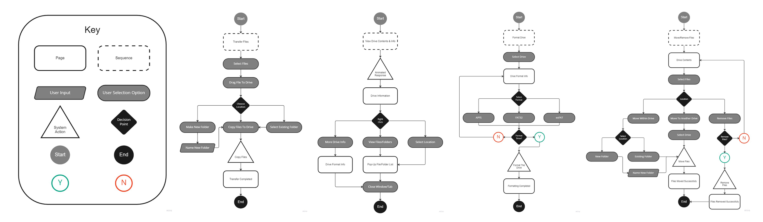
USER FLOWS:
We next hashed out the User Flows in order to display the complete paths a user will take when using FileFillet.
JOURNEY MAP:
To complete our journey in synthesis, a Journey Map was created to lay out all touchpoints that FileFillet users may have.

DESIGN
SKETCHES:
With our research fully synthesized, I created rough sketches to better visualize what FileFillet’s base flows might look like.
TRANSFER FILES FLOW (NEW FOLDER) VARIATION 1:

TRANSFER FILES FLOW (NEW FOLDER) VARIATION 2:

TRANSFER FILES FLOW (NEW FOLDER) VARIATION 3:

LOW FIDELITY PROTOTYPE:
We then created a low fidelity prototypes to enable early visualization of FileFillet in an effort to provoke innovation and improvement through the user testing that would soon come.

HIGH FIDELITY PROTOTYPE:


LOGO REDESIGN:
Once the High Fidelity Prototype was completed, I decided FileFillet’s logo needed some love. With the aesthetics we used in mind, I created several logo ideas for FileFillet stakeholders to chose from:

FINAL LOGO:
This was the logo that was decided on. Notice the arrangement of the F’s, intended to resemble the very USB drives FileFillet’s users use.
VALIDATION
USER TESTING:
Once we received approval of our designs from FileFillet’s stakeholders, we began testing our prototype to get precise feedback on each feature and potentially improve the overall user experience of our designs.
The tasks we asked users to complete were:
Open up “My Documents”.
Navigate to “Folder 3.2”.
Make a new folder.
LEARNINGS
Through my externship at FileFillet, I gained valuable insights into the design and development of user-centric digital products. Below are some of my key learnings from this experience:
User research is crucial: Prioritizing user research helped us understand our target audience's needs and pain points better. We conducted surveys and user interviews to gather insights and feedback, which informed our design decisions and helped us create a more effective product.
Collaboration is key: Working closely with developers, project managers, and other stakeholders allowed us to create a cohesive user experience that aligned with business goals. By involving everyone in the design process, we ensured that our product was feasible, scalable, and met the needs of all parties involved.
Simplify complexity: Our product involved complex technical processes, but we aimed to simplify these as much as possible for the end-user. We used clear and concise language, minimalistic design, and intuitive user flows to make the process of transferring files as seamless and easy-to-use as possible.
Overall, my externship at FileFillet taught me the importance of putting the user first in product design and development. By prioritizing user research, collaboration, simplicity, and continuous testing and iteration, we were able to create a product that met the needs of our target audience and provided a seamless and efficient experience.