

Hoppy Hour, the preferred platform for affordable leisure options while on a budget.
ROLE:
Designer: All UX/UI Design
Researcher: All research
DURATION:
10 weeks
KEY SKILLS:
Ideation, Interviews, User Stories, Journey Maps, Information Architecture, Visual Design.
TOOLS:
Adobe XD, Illustrator
THE PROBLEM
The skyrocketing cost of living in metropolitan areas has made unwinding and engaging with one’s own city an inaccessible, impractically expensive endeavor.
SECONDARY RESEARCH
COMPETITIVE RESEARCH:
The first step on my journey to address this problem was identifying leisure-centric services in an effort to find press coverage, reviews, trade publications, and videos on them in order to discover findings that will help my own research. I used Advanced Google Searches and Statista to run several searches including:
“Budget activities”
“Event Finding”
“Activity Engagement”
“Leisure Activities”
While there was a large amount of material regarding the leisure economy and activity finding apps, the fact that almost none of them provided options for those on a budget was both interesting and concerning. Like our wallets, there is indeed a void in this market for a financially accessible leisure service.

NOTABLE FINDINGS:
5x
Boasting a 5 year annual growth rate, bars are outpacing all other leisure sectors combined in New York City.
PRIMARY RESEARCH
With this information at hand, I set on a path to conduct my Primary Research.
But first, I needed a Research Plan, the objective of which was to identify potential users and find solutions to improve leisure accessibility in metropolitan areas.
METHODOLOGIES:
USER SURVEYS
to establish demographics and inform participant curation.
USER INTERVIEWS
to empathize and understand both pain points and behavioral patterns of participants.
After I established a demographic based on User Surveys, I sent out a Screener Survey to 20 people, and based on the answers received, I chose 5 who fit the bill most to do full on in-person interviews on a path towards empathy and understanding of those experiencing this problem.
USER DEMOGRAPHICS:
Age 21 - 35
Live in metropolitan area
Low to middle class
SYNTHESIS
AFFINITY MAPPING:

EMPATHY MAPPING:
THINK:
Can I afford to go out tonight?
What options do I have to save money when I go out?
How am I going to budget my night?
What alternatives do I have other than going out?
Which place has the cheapest options?
FEEL:
Angry that things are so expensive.
Ashamed that they can’t afford it.
FOMO.
Helpless.
Desire for the human experience.
SAY:
“Maybe let’s go somewhere cheap?”
“I can’t afford to go out tonight.”
“Is it an expensive place?”
How’s the vibe there?”
DO:
Searches for cheapest leisure option.
Stays in for the day/night.
Order the cheapest option.
Suggests budget friends options.
PAIN:
Fear of missing out.
Sad due to inability to do things.
Always thinking about money.
Missing out on the human experience.
Constantly living on a budget.
GAIN:
Options when doing leisure.
Freedom in city engagement.
Ability to engage with friends & meet people.
Ability to discover new places.
INSIGHTS:
INSIGHT 1:
Across the board, users expressed frustration, feelings of shame, FOMO, and even depression as a result of their budgetary restrictions when going out in their city. The emotions associated with a lack of financial freedom are, well, dark. This problem is affecting serious issues such as mental health and self-worth.
INSIGHT 2:
Users longed for a budget focused service to help them. Not one user could name a budget focused leisure or event finding service, and when greeted with the idea of one, the excitement was visible.
INSIGHT 3:
Going out to bars comprised the overwhelming majority of leisure activities in cities. In metropolitan areas, leisure activity is often limited, leading users to the most accessible options. This comes in the form of bars and restaurants.
INSIGHT 4:
Users expressed a deep desire for the human experience involved in going out, though felt as though they weren’t able to without worry. Humans are inherently social creatures who more often than not crave togetherness, and when the vast majority of social venues are places like bars and restaurants in a city, the deprivation of freedom due to finances strips us of this.
At this point in my synthesis, it became concerningly clear that the inability to go out in your city due to budgetary restrictions more often than not leads to frustration, feelings of shame, FOMO, and even depression. The emotions associated with a lack of financial freedom need to be taken seriously, as this problem is affecting serious issues such as mental health and self-worth.
PERSONA:

PROBLEM STATEMENT:
It is abundantly clear that leisure activities in metropolitan cities are not practical or accessible to a large amount of residents due to financial restrictions. With this in mind, I continued to the “How Might We” questions, designed to establish and more accurately define the problem space. These questions are:
HOW MIGHT WE QUESTIONS:
How might we reduce feelings of FOMO in cities on a budget?
How might we help people go to bars without spending too much money?
How might we incentivize people to explore cities through visiting restaurants and bars, without paying an arm and a leg?
SOLUTION IDEA

Based on the synthesization of primary and secondary research, I developed a budget centered service that allows users to easily find both deals and happy hours in their area.
This is Hoppy Hour, here to facilitate a hybrid social and leisure service for those on a budget.

USER STORY PROCESS
Using the MVP (Minimum Viable Product) model I started the user story process by creating User Stories to fulfill the How Might We questions. Additionally, this provided outlines of the expected interactions users will have to go through to complete their goals in the digital product.
USER STORIES:

USER FLOW:
I then created a User Flow, to visualize the user's path to finish a specific task, the one you see here is for the first flow: finding a happy hour.
Notice the hierarchy, these are the paths Sonny would take to complete this task as someone who wants to stay local.

SITEMAP:
The next step was creating a sitemap, allowing me to architecturally visualize how individual content sections are related to each other.

DESIGN
SKETCHES:

Rough sketches were then created to better hone in on what this service might look like, the ones you here are also for the “find a happy hour” flow. Notice the map being a pivotal and easily accessible page, this is because the competitive analysis and user interviews overwhelmingly indicated people want to stay local more often than not. Additionally, they also indicated an affinity for a list display to greet users with suggestions, something you can see on the first screen.
WIREFRAMES:

Once completed, I remade and polished those sketches into wireframes. These wireframes were then used for guerrilla user testing in order to gain feedback and base functionality before moving onto aesthetics.
MOODBOARD:

This leads us to our mood board. For the fonts, I wanted to go with relaxed, celebratory fonts that are frequently found in places like bars and many beverages and packaging design.
After some research into color theory, green is universally regarded as the color most associated with comfort and proven to diffuse anxiety, an inviting aesthetic designed to extinguish the anxieties Sonny feels on a daily basis.
As for the layout, I found simplicity and elegance key to creating the desired digital environment for Sonny to slip into when wanting to take a load off.
HIGH FIDELITY SCREENS, VERSION 1:
With these aesthetics in mind, I created a first round of screens:

TESTING & ITERATION
Once completed, I created a prototype and wrote a script before beginning my first round of user testing with 4 participants, all based on the same curation criteria as previously shown during the Primary Research phase. The objective of which was to evaluate Hoppy Hour’s user experience, and determine if these users can easily and intuitively use it.
In order to do so, the tasks I asked them to complete were:
What does the primary function of this app appear to be?
What options does it seem you have while looking at this screen?
Find a happy hour at this time.
Remove one or multiple bars from a crawl.
Add a bar to one of your crawls.
View available deals in your area.
View your saved places.
FEEDBACK:
After multiple rounds of testing with multiple groups of users, I then iterated the prototype in an effort to steadily refine the design.
RESULTS FROM ITERATION:

FINAL SCREENS

FLOW 1: FIND A HAPPY HOUR
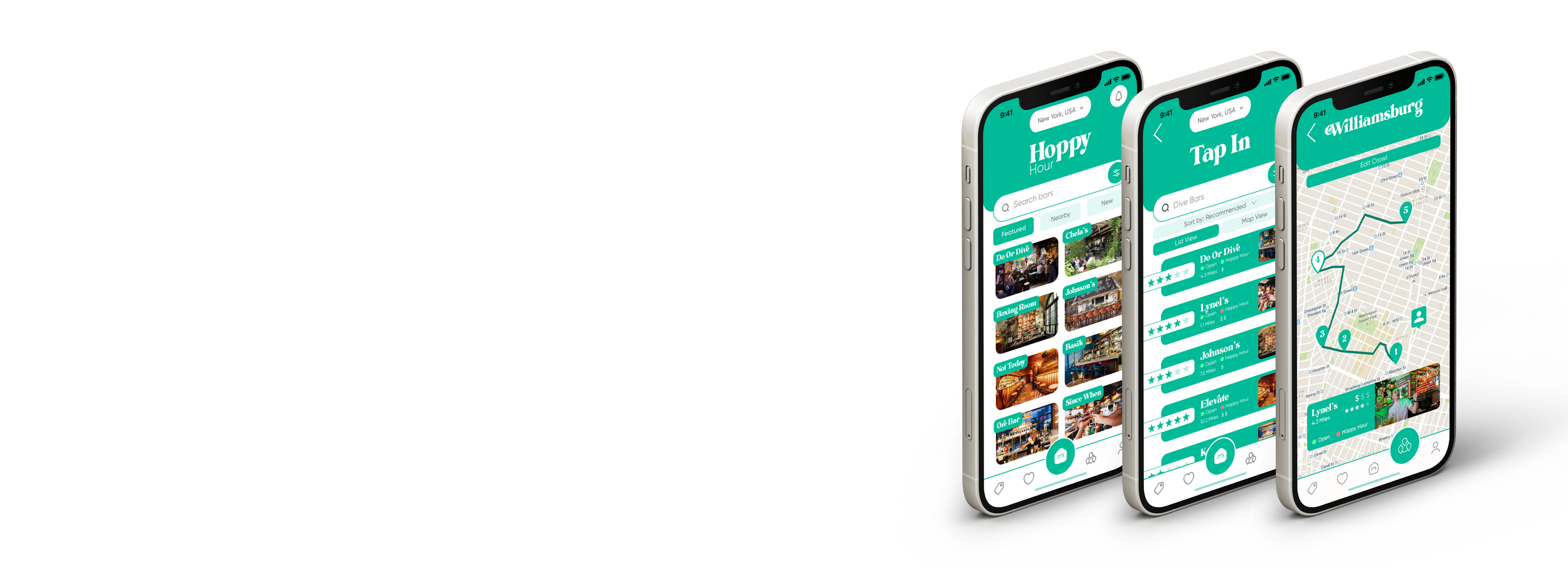
Let’s go through some of Hoppy Hour’s flow, and say that it’s our good friend Sonny’s day off and he wants to celebrate, socialize, and unwind. Sonny doesn’t make a lot of money, but doesn’t want that to stop him, so he opens Hoppy Hour and goes through the “find a happy hour” flow.

FLOW 2: MAP OUT A BAR CRAWL
Once at the bar, he meets up with some friends and wants to keep the night going by embarking on a bar crawl. Sonny then goes to into Hoppy Hour, hits the Crawls, and edits his crawl for the night.

FLOW 3: VIEW DEALS
After a couple bars, Sonny and his friends' wallets are feeling a bit hurt and decide to find somewhere with a good deal around them. They go to the Deals section, and see what’s around them.

FLOW 4: VIEW SAVED PLACES
Alternatively, Sonny remembers some good places around and instead goes to his saved places to check them out.

PROTOTYPE PRESENTATION:
LEARNINGS
This project’s biggest challenge was honing in on aesthetics, as during usability testing the differences in user opinion varied both passionately and vastly with some insisting to not change a thing and others feeling overwhelmed by it. I was able to overcome this by maintaining the base colors of earlier iterations, simplifying UI elements, and varying the color palette. This allowed me to maintain its initial identity while utilizing more traditional, familiar secondary colors. This helped me learn that it’s okay to adopt more traditional UI elements, and better understand the balance between aesthetics and functionality.
My final design was very successful. After multiple rounds of user testing, 5/5 users were able to complete the assigned tasks without a hiccup. Additionally, without prompt almost all users voiced that it’d be a product they’d use.
